Lights

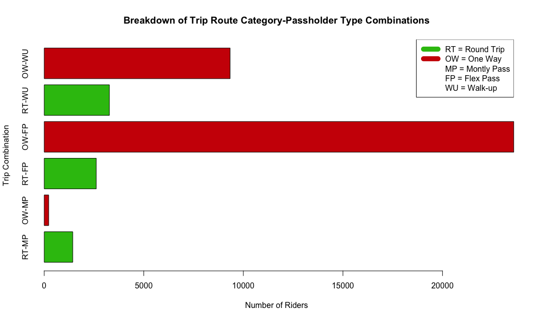
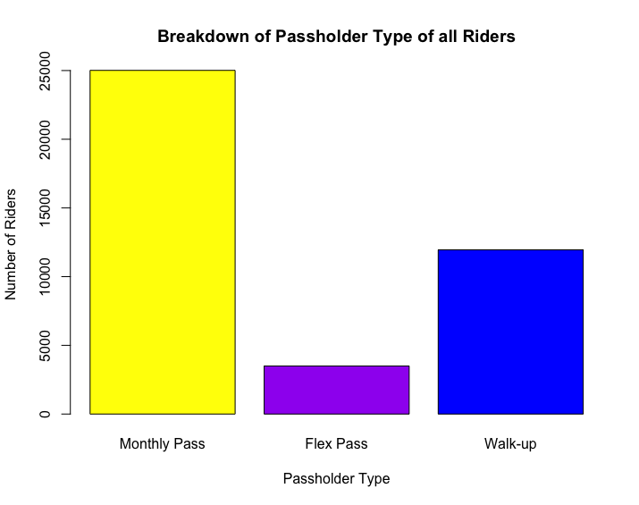
Passholder Types Among Riders

With purple representing flex passholders and yellow representing flex passholders, this data visualization suggests there are more customers who use flex pass than monthly passes in the LA area. They may be consistent riders who use long-term passes because of the conveniency of the LA Bus Share service.

Mountains

Duration of Trip in Various Months

This Tableau Visualization grabs the start time and end time of each trip and calculates the overall duration of the trip. It then compares the durations of trips in each month of the year. This helps us understand the frequency of different types of trips that range in duration. This is helpful for executive members to make decisions on how often they should offer the service and what times during the year they should focus more on.

Lights

Distribution of Trip Types

The data tells us that the majority of the rides were One Way trip and a small portion of the rides were Round Trip. This may suggest that in LA most riders use one way trip type to get to their destinations.

Lights

Breakdown of Trip Combinations

This depiction shows the breakdown of Trip Route Category-Passholder type combinations. There is a legend to indicate the different acronyms used when labeling the x-axis. The One-Way Trip and Flex Pass combination is the most popular type of combination and may suggest that despite having more monthly passholders, there is many customers who use bike share on flex pass so they have the ability to use bike share but not on a monthly basis of payment.

Nature

Starting Station on Maps

Visualization of Start Station (Latitude and Longitude values) in Tableau Desktop.

Mountains

Ending Station on Maps

Visualization of End Station (Latitude and Longitude values) in Tableau Desktop.